Tooling
Design.com Logo Maker Review: Features, Pricing, and Customization (2026)
We built a logo for a fictional smoothie business to see what the editor, AI chatbot and branding previews do, and what each plan costs.

Creating a logo that looks professional can take more time than expected, especially when you’re starting a business and don’t have a designer on hand. You need something that fits your brand, looks good across different platforms, and is easy to customize without spending hours learning design software.
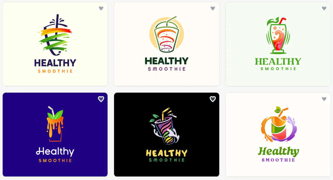
We tried Design.com’s Logo Maker to see how well it handles that process. For our test, we used Healthy Smoothie, a fictional smoothie business, to explore the logo options, editing tools, AI features, and branded previews. We also looked at how easy it was to adapt a design for different uses, from business cards to websites and storefront signage.
Here’s what we found, including the features we liked, where the tool could be better, and what to know about pricing before getting started.
What Is Design.com Logo Maker?
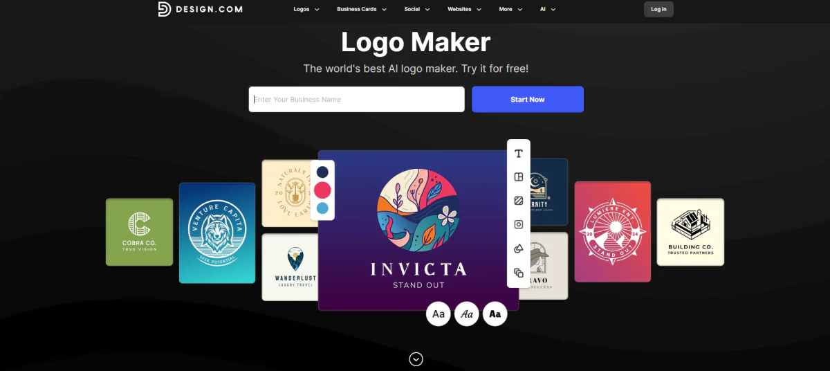
Design.com’s Logo Maker is an online tool for creating business logos using editable designs and customization features. You can start with your business name, browse logo options, and adjust the design to suit your brand without needing advanced graphic design skills.
During our test, we used Healthy Smoothie as the business name to see what kinds of designs the tool would suggest for a smoothie brand. We wanted something fresh and approachable, with visual elements that could communicate fruit, health, and natural ingredients.
One thing worth noting is that the Logo Maker is a good starting point for exploring a range of designs.
If you already have a specific concept in mind, you can also try the Design.com AI Logo Generator. It gives you another way to approach logo creation when you want to describe a more particular idea rather than browse general options.
Testing Design.com Logo Maker: How It Works
1. Enter Your Business Name
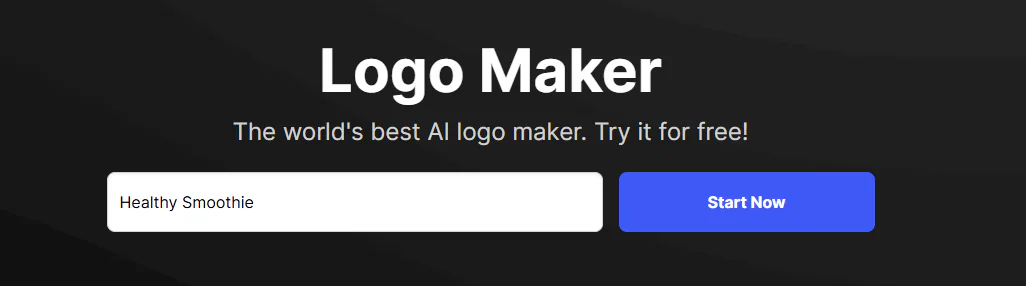
We started by entering Healthy Smoothie into the Logo Maker. This was straightforward, and we didn’t need to prepare a detailed brief or have a finished brand concept before getting started.
We liked that the process starts with something simple. For a new business owner who hasn’t settled on a logo style yet, starting with just a name makes the first step less intimidating.
2. Refine the Keywords
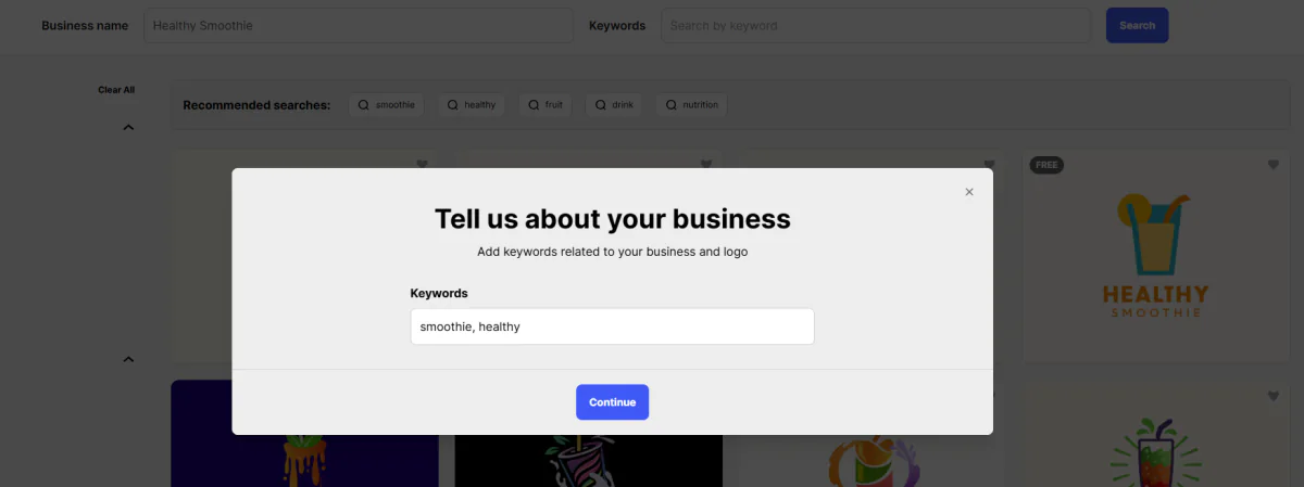
3. Browse the Logo Results
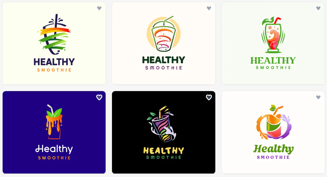
Once we reached the results page, we could browse logo concepts for Healthy Smoothie. We looked for designs that would suit a smoothie shop, particularly those that could work with fruit-inspired imagery, fresh colors, and readable lettering.
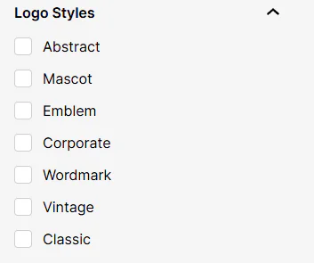
We also liked that we could filter the results using the options on the left side of the page. By ticking or unticking the checkboxes, we could narrow down the designs based on our preferences and focus on the logo styles that best matched the brand. This made it easier to explore specific directions rather than scroll through every available option.
Here are some of the logo results by filter:
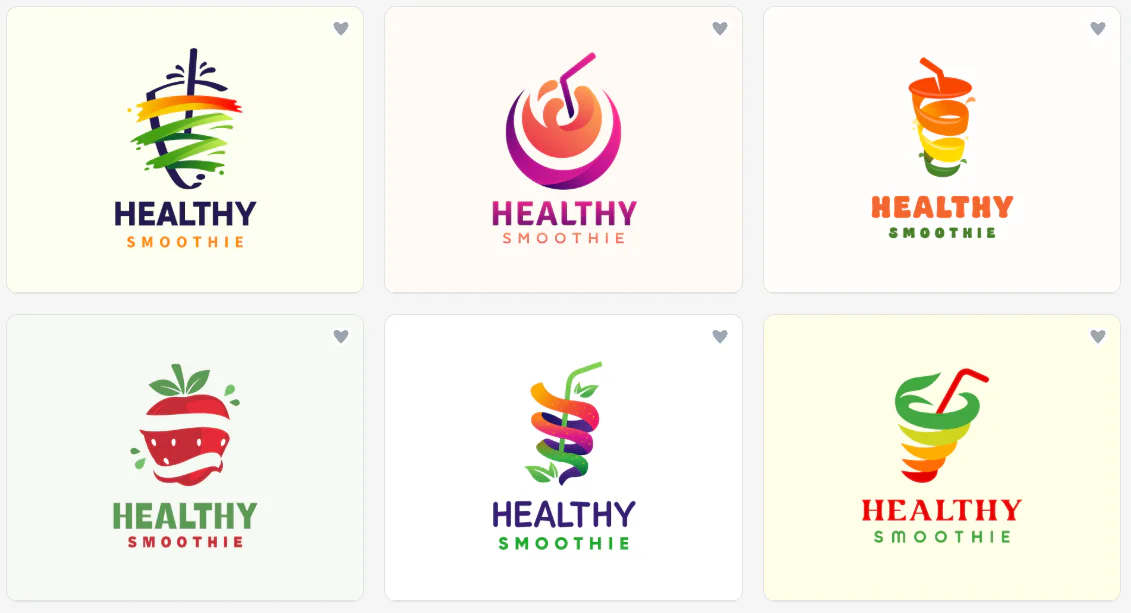
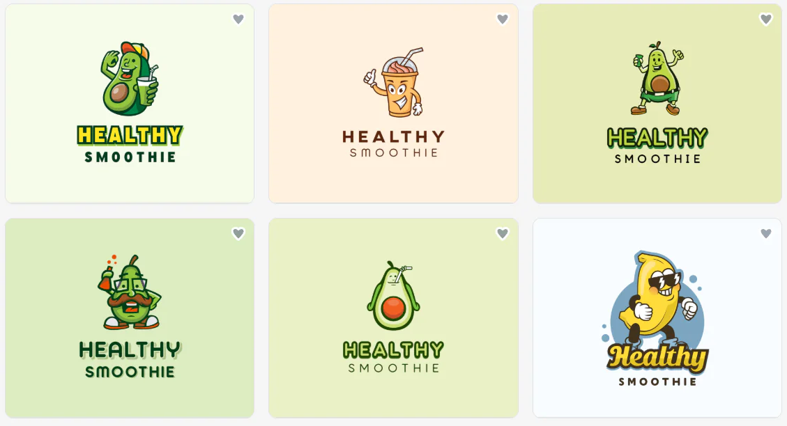
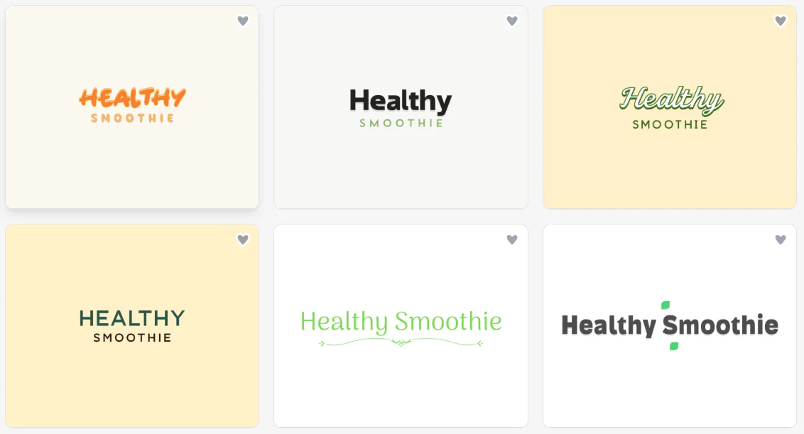
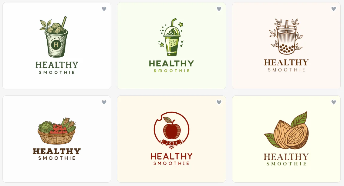
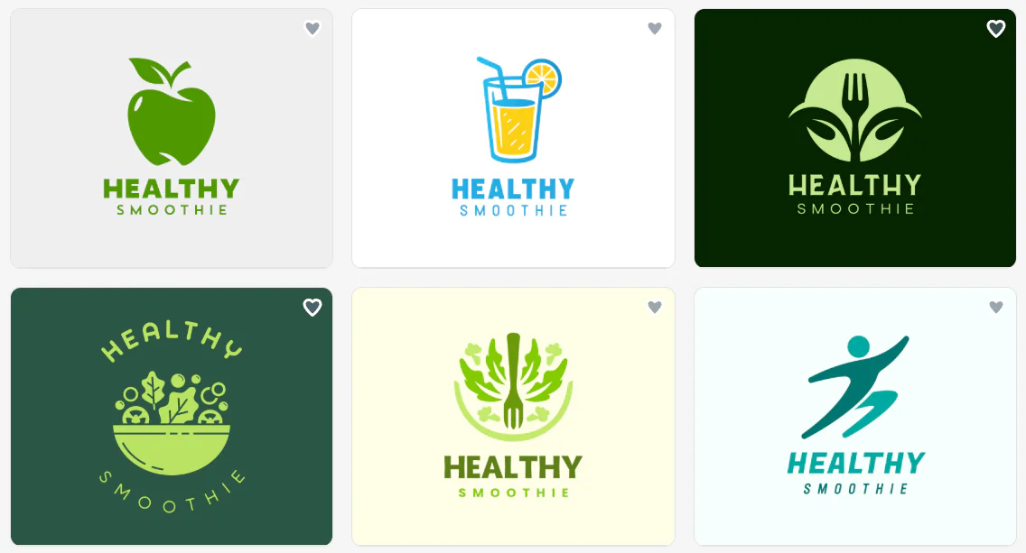
Having these options helped us see how different combinations of icons, fonts, and layouts could influence the brand’s overall look. If you have a specific style in mind, we recommend using the filters to narrow your choices. You can also browse multiple styles before deciding which design to customize.
Our advice is to shortlist a few designs before moving into the editor. A logo can look appealing in the results grid but work differently once you consider how it will appear on packaging, business cards, or a website.
Customizing the Healthy Smoothie Logo
Finding a design we liked was only the beginning. We then explored the editor to see how much we could change without having to start over.
Change the Background Color
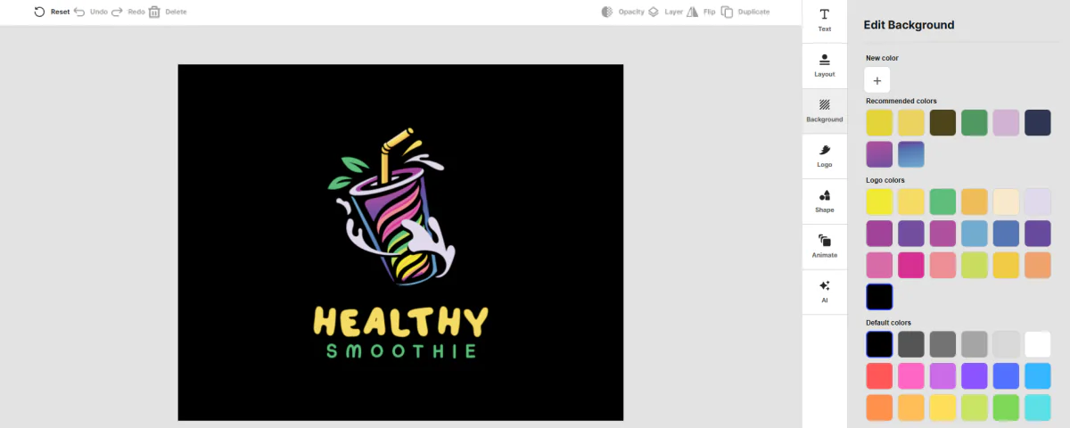
We started with the background because it can affect how a logo looks against different surfaces. A light background might work well for a website, while a darker one could help a logo stand out on promotional materials.
We could explore different background colors and compare how they affected the overall appearance.
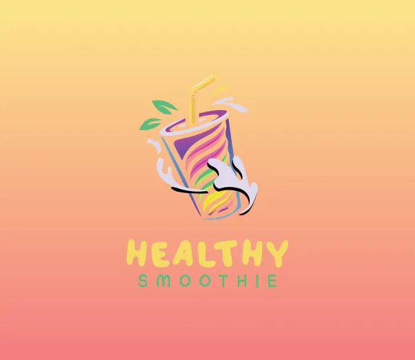
For Healthy Smoothie, we would lean toward a clean, light background to keep the design fresh and make the logo easy to read.
It’s worth checking the contrast before settling on a color. A background that looks attractive on the editor screen may not work as well when the logo is displayed at a smaller size.
Adjust the Logo Colors
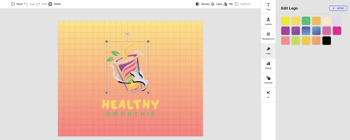
Next, we explored the logo color settings. This is where we could move the design closer to the visual identity we had in mind for Healthy Smoothie.
For a smoothie business, greens can suggest fresh ingredients, while oranges, yellows, and reds can bring fruit to mind. We would use these colors selectively rather than combine too many shades in one logo.
We liked having color customization available during the editing process. It gives you room to experiment with different brand directions without having to choose an entirely new design every time you want to try a different palette.
Explore Typography Options
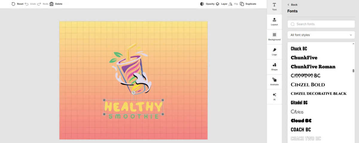
Typography can change the personality of a logo just as much as its icon or colors. A rounded font may give Healthy Smoothie a friendly, casual feel, while a simpler sans-serif typeface can create a cleaner, more modern look.
We explored the available typography options to see how the business name could look in different styles. One thing we would prioritize is readability. The name should remain clear on a small social media profile image and when printed on a business card.
We also recommend considering the length of your business name. Healthy Smoothie has two words, so the font and spacing need to work together without making the logo look crowded.
Add or Adjust Design Elements
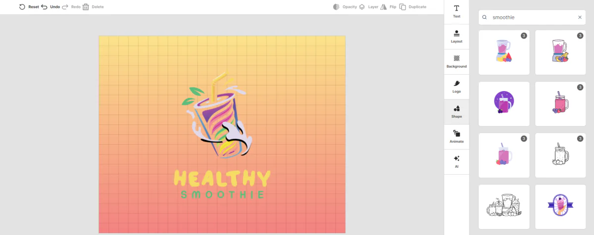
We also checked the elements customization options. These are useful when you want to adjust the visual details of a design or explore ways to make it more relevant to your business.
For Healthy Smoothie, imagery of fruit, leaves, or a simple smoothie cup could help communicate what the business offers. However, we’d avoid adding too many decorative elements. A logo needs to be recognizable at a glance, and too many details can make it harder to use at smaller sizes.
The best approach is to make a few deliberate changes, then compare the updated design with the original. That makes it easier to see whether each edit improves the logo or simply adds clutter.
Refine the Logo With the AI Chatbot
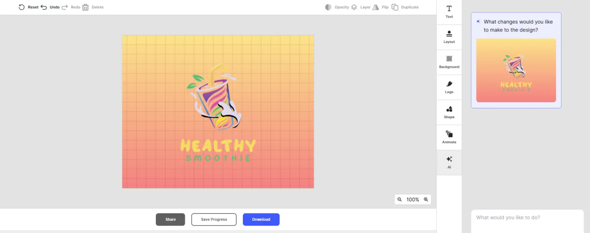
One feature we wanted to explore was the AI chatbot. Instead of relying entirely on manual edits, you can use a text prompt to describe the changes you want to make to a logo.
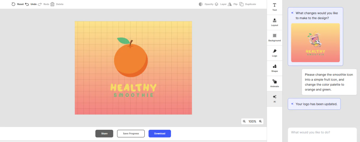
For example, we asked for a more natural look: a simpler fruit icon and color palette centered on green and orange, and it did not disappoint! This offers another way to approach customization if you’re not sure which settings to adjust yourself.
Specific instructions give the tool a clearer direction to work toward. We would still review the result carefully, though, because an AI-assisted edit may not match every detail of the original idea.
How Does the Logo Look on Different Branding Materials?
A logo needs to work beyond the editor. We also wanted to consider how the Healthy Smoothie design could look when used across everyday business materials.
Business Card Preview
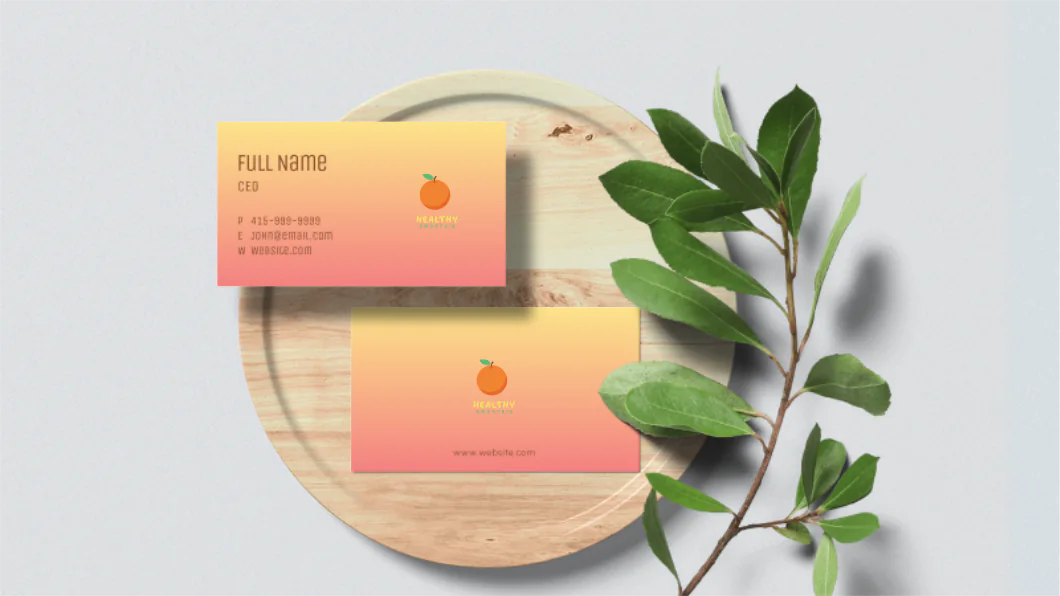
The business card preview helps you see how the logo might look in a more practical setting. This is useful because a design that looks good on a large screen can feel different when placed alongside contact details and other text.
For Healthy Smoothie, we would keep the logo prominent and leave enough space around it so the card doesn’t look crowded. The preview also gives you a sense of how the colors and typography work together in a branded layout.
Website Preview
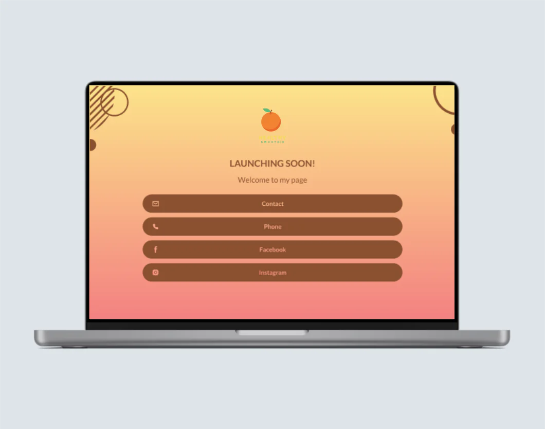
We also considered how the logo would look on a website. Consistency matters here, especially if you want customers to recognize the business across your website, social media profiles, and printed materials.
A logo that works well in a website header should be easy to recognize without taking up too much space. We would check that the business name remains legible and that the colors complement the rest of the page.
Design.com also offers website-building features through its broader platform, which can be useful if you want to develop your branding and online presence in one place.
Storefront Signboard Preview
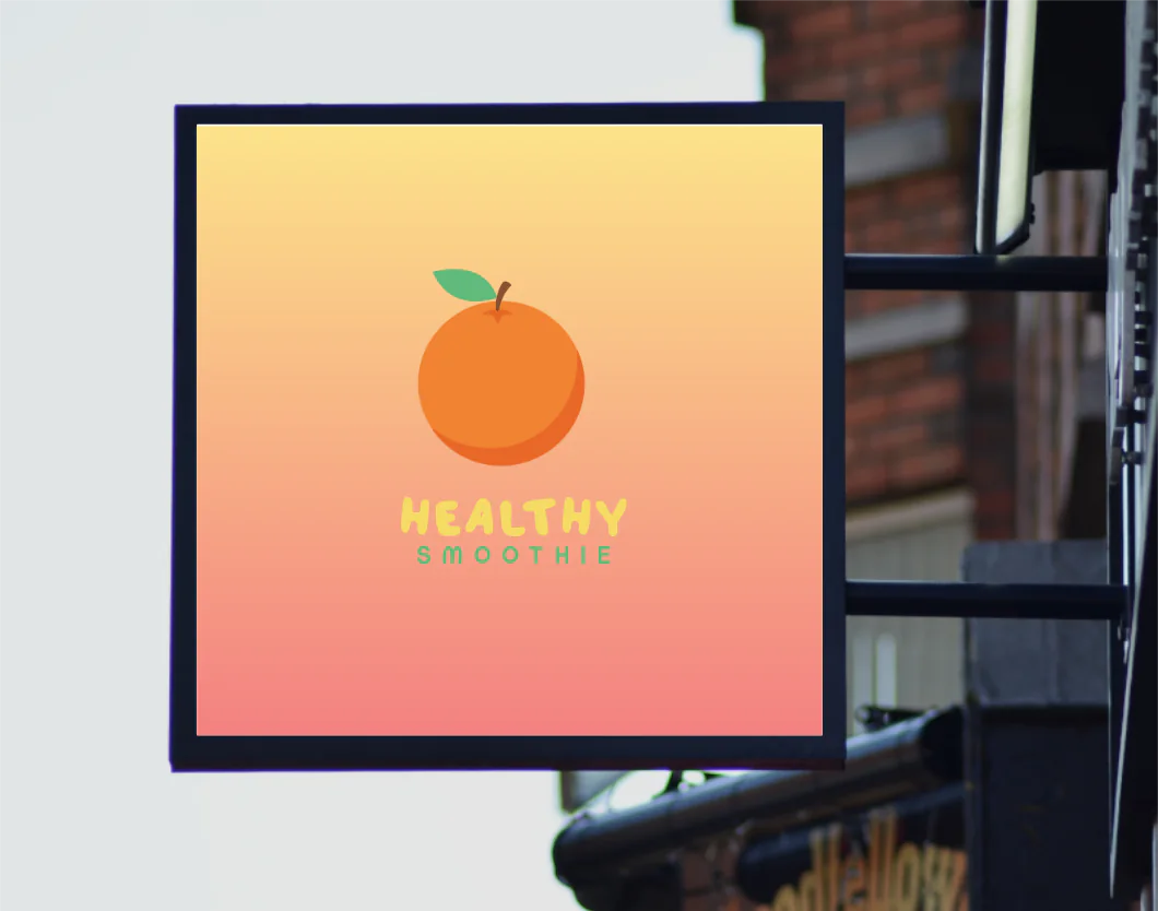
Finally, the signboard preview gives you an idea of how the logo might look on a physical storefront. This is especially relevant for a smoothie bar or juice shop where the branding needs to be recognizable from a distance.
For this use case, we’d prioritize a clear icon, readable lettering, and strong contrast. Intricate details might look attractive on a desktop screen but become less noticeable on a signboard.
These mockups are helpful for visualizing a brand across different applications. Keep in mind that previews are for presentation purposes, so you should still check the final file dimensions and print requirements before sending a design to a printer.
Design.com Logo Maker Features: What Stood Out to Us
After going through the logo creation and editing workflow, a few features stood out as particularly useful.
A large selection of logo designs
One of the main benefits is the variety of designs available to explore. Instead of committing to a single concept immediately, you can compare different logo styles to see which direction suits your business.
For Healthy Smoothie, we’d look for designs that communicate freshness without relying on overly complicated illustrations. Browsing multiple options makes it easier to compare icon styles, typography, and layouts before choosing a favorite.
Customization without advanced design skills
The editor brings together several important adjustments, including background colors, logo colors, typography, and graphic elements. We like this approach because it gives beginners room to refine a design without having to learn a professional design application first.
You can also explore features such as curved text and gradient colors, as well as a library of vector shapes.
AI-assisted editing
The AI chatbot is another useful addition. It gives you an alternative to manually adjusting every detail and lets you describe a change in plain language.
We’d use it to explore creative directions or make targeted refinements, then check the output before deciding whether to keep the changes. It works best as part of the editing process rather than a replacement for reviewing the final design.
Branding previews and additional tools
We also see value in being able to preview a logo in different contexts. Business cards, websites, and storefront signs each have different requirements, and mockups can help you spot potential readability or layout issues early.
Design.com also offers more than logo creation, with tools for business cards, social media graphics, websites, flyers, and other branded materials. This broader set of tools can be useful if you want to keep your branding consistent as your business grows.
How Much Does Design.com Logo Maker Cost?
Design.com has a free option and paid subscriptions. The right choice depends on whether you need a basic logo or want access to a broader collection of branding tools.
| Plan | Monthly Billing | Annual Billing |
|---|---|---|
| Free | $0 | $0 |
| Starter | $9/mo | $3/mo |
| Value | $14/mo | $4/mo |
| Premium | $19/mo | $5/mo |
Here’s what to consider when choosing a plan:
- Free: A good starting point if you want to explore the tool and use an eligible free logo. Not every design is available for free download.
- Starter: Suits users who want a logo and access to additional design tools.
- Value: Adds website-building features to the Starter offering.
- Premium: Includes the Value features, plus tools such as a link-in-bio creator and digital business cards.
Design.com’s purchasing information explains that paid subscriptions include logo files in formats such as PNG, JPG, SVG, EPS, and PDF. The plans also provide access to editing tools and other design resources.
One detail to keep in mind is that a subscription is tied to a particular logo. You can create variations of that logo, but creating a completely different logo requires an additional purchase.
Before paying, check the current checkout price and the terms of the specific plan you choose. Annual billing has a lower monthly equivalent, but it requires a longer upfront commitment.
Design.com Logo Maker Pros and Cons
After reviewing the workflow and available features, here’s how we’d summarize the main advantages and drawbacks.
Pros
- Beginner-friendly workflow: You can start with a business name and refine the design from there.
- Plenty of design options: Browsing different concepts gives you a way to compare styles before settling on one.
- Useful customization tools: Adjust colors, backgrounds, typography, and other visual elements.
- AI-assisted editing: Text prompts offer another way to communicate the changes you want.
- Additional branding tools: The platform extends beyond logos to websites, business cards, and marketing materials.
- Multiple download formats: Paid logo packages include raster and vector formats for different uses.
Cons
- No native app yet; web-based only
Who Should Use Design.com Logo Maker?
We’d recommend Design.com to people who want to create a logo without hiring a designer or learning complicated design software.
It’s particularly relevant for:
- Small business owners: Create a logo for a new shop, restaurant, service, or local business.
- Startups and entrepreneurs: Explore branding concepts before investing in a larger design project.
- Freelancers and creators: Develop a logo and matching visual assets for a personal brand.
- Businesses building their first website: Explore logo creation alongside website and other branding tools.
- Users who want to experiment: Compare logo styles and make adjustments before committing to a final design.
For our Healthy Smoothie example, the tool offers a practical starting point. We could explore different concepts, refine the visual direction, and consider how the logo might work across digital and print materials.
However, if you need a highly distinctive logo with detailed illustration work, strict brand guidelines, or exclusive design requirements, you may still want to work with a professional designer. An AI-assisted logo tool can help you develop ideas, but it doesn’t remove the need to assess originality, readability, and suitability for your business.
Final Verdict: Is Design.com Logo Maker Worth Trying?
Design.com Logo Maker is worth considering if you want an accessible way to create a logo and explore different branding options in one place.
What stands out is the combination of logo browsing, hands-on customization, and AI-assisted editing. You can begin with a business name, explore designs, adjust the visual details, and preview how the branding might look on different materials. The additional design tools are also useful if you want to work on more than just your logo.
Our main recommendation is to take your time comparing designs and refining the one you choose. For Healthy Smoothie, we’d prioritize a recognizable icon, fresh but balanced colors, and lettering that stays readable across different sizes.
If you already have a specific visual concept in mind, try and explore Design.com today!